Swap-bot Time: April 25, 2024 8:15 am
www.swap-bot.com

TH Technique #3 - Embossing Resist ATC

Launch gallery slideshow

TH Technique #3 - Embossing Resist ATC
Group:Tim Holtz Addicts
Swap Coordinator:dobie256 (contact)
Swap categories: Art  Artist Trading Card (ATC)  Handmade 
Number of people in swap:9
Location:International
Type:Type 3: Package or craft
Last day to signup/drop:April 30, 2011
Date items must be sent by:May 17, 2011
Number of swap partners:2
Description:

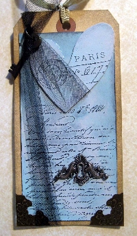
This is the third in a series of technique swaps. This is a really easy technique that I used before discovering Tim Holtz. But it works very well with his style of layering. You will be making one ATC for each of two partners (2 ATCs total). ATCs are 2.5 x 3.5" in size.

This sample tag shown was the third tag I made in the class I took with Tim Holtz last May in Novi, Michigan.

Step #1: Stamp your image on your cardstock of choice. Immediately heat emboss the image. You can use colored ink and clear powder. Or clear ink (like VersaMark) and colored powder. Just DO NOT use resist powder for this step!

Step #2: Color your background using 2-3 colors of distress ink. The embossed areas will resist this ink. Once you are done with the distress inking, lightly wipe your card with a barely damp paper towel. Any ink that was on top of the embossed areas will wipe off (resist).

Step #3: Embellish your ATC to your heart's content!

This card will have a bit shorter turn-around on it since it is so easy (and I have some other more complicated techniques to share with you soon).

Have fun and feel free to PM me with an questions or concerns.

Discussion

AsAlwaysAngela 04/20/2011 #

This is one of my all time favorite techniques to use so count me in!

flowerchild 04/20/2011 #

but it's to close to Mother's Day for me :( next time for sure!!!

KellyS 04/21/2011 #

Are we using regular embossing powder and not the TH distress powder?

dobie256 04/21/2011 #

For the background distress to work you must use REGULAR embossing ink. You can use distress embossing on other elements of the card (or on just part of the background to see how it works -- I would think that wherever the powder flakes off would no longer resist the distress ink).

Does Mother's Day interfere with anyone else? It's not due until 10 days after Mother's Day. If several of you would like me to extend the deadline a bit I can. JLMK

TurtleLove 04/29/2011 #

I just completed mine and I have to ask...is this a VERY subtle technique? Although I like the ATC...I think I did something wrong bc it looks the same as if I had put the background color down and then just embossed over it. (I think) I used versamark and a green embossing powder over it if that makes any difference since there are two options listed.

Tynkerbelle 04/30/2011 #

I wondered the same as @TurtleLove i used clear emboss ink and red and gold emboss powder. And i do like the way it looks i kinda thought the same...did i do something wrong? Cool atc but not noticable as to what technique i used...

TurtleLove 04/30/2011 #

OK...I went ahead and signed up since I have this completed BUT I am not sure about the answer to my question so Dobie- if you get this and upon seeing my FLickr photo think I did it incorrectly, please just remove me. I will try to check back for the answer by midnight.....thanks.

dobie256 05/ 1/2011 #

Sorry gals I was at a weekend crop and just got home. Yes, it is a very subtle technique. And not really original to TH although he taught it in one of his classes. If you look at the example on this swap he stamped the French text in dark blue, embossed it with clear powder, then we added distress inks, and wiped it with a SLIGHTLY damp paper towel. The embossing resisted the inks. This technique has been used in stamping for a long time. KellyS worked on this project at our crop. She stamped a light color image, embossed it, then did the distress ink. The light image really popped. I don't think it would look the same doing the distress ink then trying to stamp a light image on top.

So play with it a bit and have fun and don't distress HaHa! I'm sure everyone is doing it correctly. You can make it very subtle or bolder depending on your color combinations.

AsAlwaysAngela 05/ 3/2011 #

If you want a less subtle affect, make sure your background is a light color. Use a clear ink (like VersaMark) and a clear embossing powder (like UTEE- that's ultra thick embossing enamel). Then go over it with your distress inks. Your image will really pop!

dobie256 05/ 6/2011 #

You can use light paper and light embossing inks and dark distress inks. You can use darker paper dark embossing inks and even darker distress inks. You can use medium paper clear embossing inks and dark distress inks. ANY combo will give you a nice effect, so play and have fun. I NEVER use versamark (because I like TH clear embossing ink more) and I also never use UTEE. This is a very easy technique. Whether it is subtle or bold depends more on color combinations than anything else.

Leave a Comment

You must be logged in to leave a comment. Click here to log in.

I received the item
I sent the item

Received from:
For multiple members, separate names with spaces

Description: